Color accuracy is an important factor in photography and retouching. Modern day cameras rely entirely on the built-in software to interpret the color data in the captured images, and how the colors are captured will be a direct reflection of how accurately they will be represented in the resulting images. Unfortunately, several factors, such as the temperature of the lighting, White Balance settings, and even the type of lenses and filters used can alter colors in a captured image. Here is where a color chart (or color reference card) comes to the rescue.
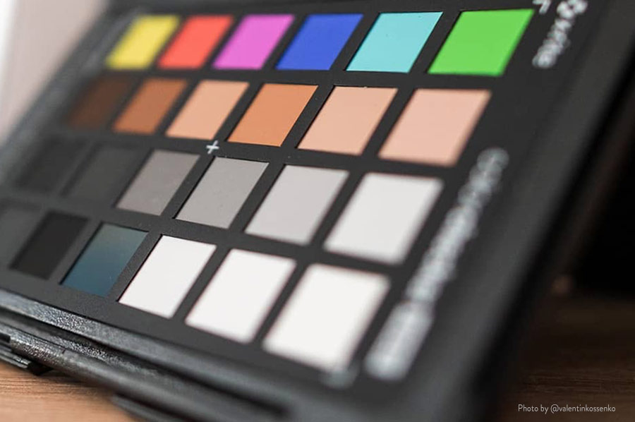
Originally introduced in 1976, a color chart – first produced as the “Macbeth ColorChecker”, a cardboard-framed arrangement of twenty-four squares of painted samples based on Munsell colors – is a color calibration target that is used in the scene that is being photographed, and later used as a color reference in post-production to ensure color consistency from the capture to the output image, digital or printed.
RELATED: How to Color Calibrate All of Your Devices for Accurate Color
I have been using the X-Rite ColorChecker Passport color chart for the past several years and it still looks like new. The ColorChecker is rather a pricey item, but if used with care, it will serve you for many years and help you ensure that the colors you work with are consistent throughout the entire creative process.
While modern-day camera technology does give us a lot of leeway when we shoot in Raw format, it is important to note that adding a color chart in a single frame during a shoot can make a monumental difference in post-production. Without a precise color reference, the colors in your images are only a subjective guess. It might be good enough for some clients, but if color accuracy is critical for the job at hand (for example, the color of a makeup product or a garment in advertising imagery), then getting into the habit of using a color checker will be highly beneficial for a professional photographer.
Check out this in-depth tutorial by Jay P. Morgan of the Slanted Lens on how to use a color chart:
Source: The Slanted Lens | Image Credits: @valentinkossenko and x-rite