If you’re a new photographer just starting to produce your shoots, you might mistakingly think that post-production and/or color grading is what makes the “look” or “feel” of a photograph. Analyzing the use of color in an image, however, requires a more layered approach.
RELATED: Color Grading with Color Lookup Tables in Photoshop
In this video by Jorge Tamez, he explains how you can produce better images by understanding the thought processes behind the inspiration, why you need to learn color theory, and how to evaluate the color composition of an inspiration image using Adobe Color CC and the Selective Color Adjustment Layer in Photoshop.
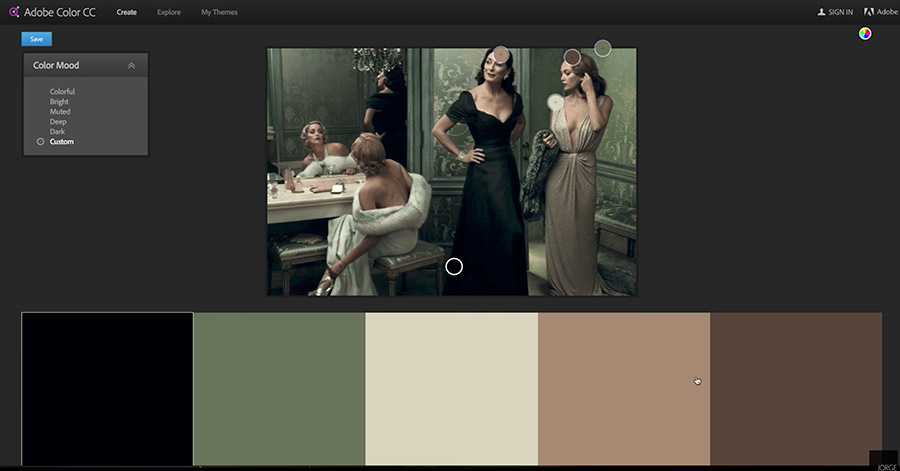
An image by Annie Leibovitz as a reference image to analyze its color palette using Adobe Color CC.
Jorge explains, “[anything] that you see in the image plays a part in how the final retouch is going to look, especially with the color grading. The location, the styling, [and] the wardrobe choices.”
“If it’s on location,” he continues, “then the time of day. If it’s indoors, then the light quality, the light source, the position of the light, all of those play a part in what the final process is going to look like. So whatever comes in will have an impact on what is going to come out of Photoshop.”
He cautions that you can’t expect to replicate an image that has soft lighting and a muted color palette like the above image by Annie Leibovitz when your photograph was taken with hard light and the subjects are wearing very casual outfits. From makeup to wardrobe and to all visual elements, you need to think about the colors of your final image when planning and styling the shoot.
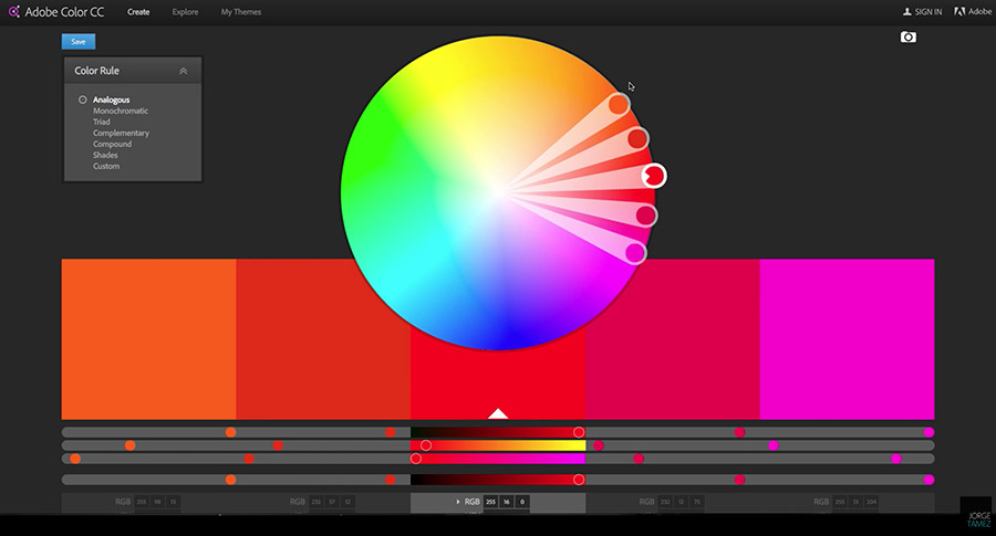
Analogous colors in Adobe Color CC’s color wheel.
But how do you create a visually appealing color composition? Color theory teaches us how color combinations work using a color wheel. Here, Jorge uses the color wheel in Adobe Color CC as a tool to see color harmonies.
Starting with analogous, where two or more colors are shown adjacent to a single base color; triadic, where three colors are equidistant from each other on the wheel; monochromatic, where two or more tints of one base color are shown; and complementary, where one color is in the exact opposite side of the other color on the wheel. Each type of color harmony gives a different visual “feel.”
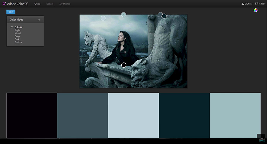
An image showing a Monochromatic color harmony. Jorge stresses that Angelina Jolie’s black outfit was chosen on purpose with the color composition in mind before the shoot.
When I studied art in college, color theory was the bedrock of my art classes. Using warm colors as an underpainting ensured my final composition of cool colors popped. As a photographer, I understand that using monochromatic cool tones of gray and blue can make the viewer feel “lonely” or “isolated” like the image of Angelina Jolie above. One very popular combination you see a lot in movie poster design is the use of complementary colors blue and orange for their eye-catching contrast.
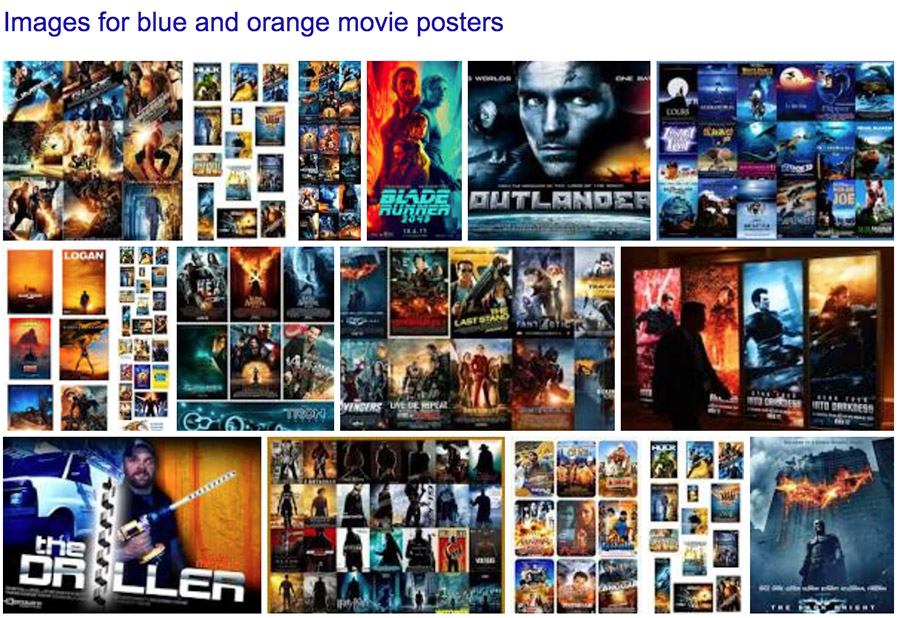
A quick Google search for “blue and orange” color palette in movie posters.
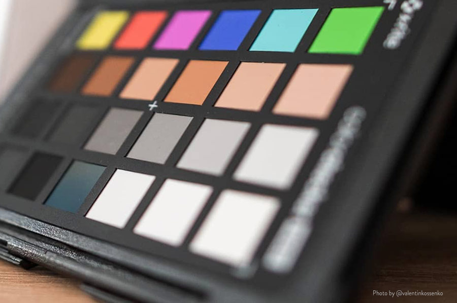
To analyze colors in a reference image, you can use Adobe Color CC to see its color palette. Import a reference picture into Adobe Color CC, or use the Select Color Adjustment Layer in Photoshop to create a Saturation Map. This allows you to see the concentration of colors in that image.
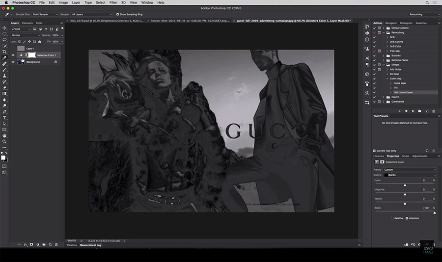
A Saturation Map of an image from Gucci, created using the Selective Color Adjustment Layer in Photoshop
Use the timestamps below to go directly to specific segments in the video:
- 0:25 Explanation Of Photographic Process
- 2:53 Color Theory
- 5:24 Evaluating the Color Palette Using Adobe Color
- 7:40 Evaluating Color and Saturation Using Photoshop
Keep these concepts in mind for your next shoot when you create a mood board and search for reference images. I hope this helps you better understand the visual elements in your inspiration so that you can create stronger work in the future.
Source: Jorge Tamez | Featured Image: Shutterstock