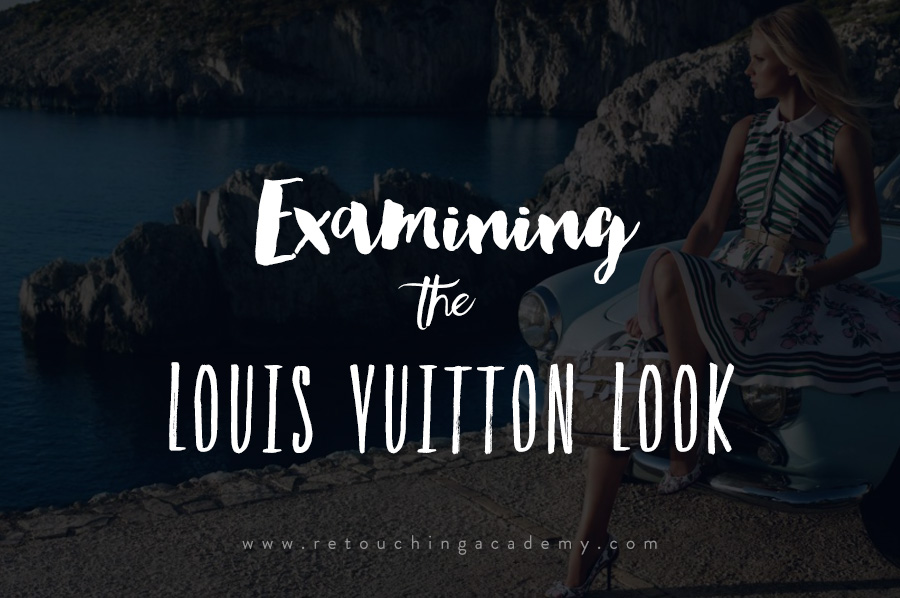
Following on from my last article in which we examined the use of complimentary colors in a Mario Testino campaign, this week I want to bring to your attention a piece in which I examined the very particular style common to many of Louis Vuitton‘s ads.
As a photographer or retoucher it’s always important to keep an eye on excellent and outstanding examples of work, and learning how to break down what makes them so effective.
The Louis Vuitton ads are a great example of tying a campaign together using colour theory, a sound knowledge of which can be invaluable to any photographer or retoucher looking to draw on hundreds of years of research into the psychology and effect of colour harmonics.

Uma Thurman © Louis Vuitton
In this piece I delved a little deeper into color theory and achieving pleasing harmonics, looking specifically at why the cyan blues contrast so beautifully with the skin tones and the reds present in the products. There’s a bit of a history lesson in there too!
Pleasing colour aesthetics and complimentary colours were intensely researched centuries ago by painters, so we have an astonishing store of that knowledge as 21st century photo retouchers to draw upon.

Sean Connery © Louis Vuitton
This is not only vital information for retouchers, but even more so for photographers when location scouting, set dressing and prop hunting. Planning the final look of the shoot in terms of a harmonious color palette can really pay off big, and Louis Vuitton have some outstanding examples of this. Everything in shot is carefully chosen to fit the brand palette, with the retouching tying everything beautifully together.
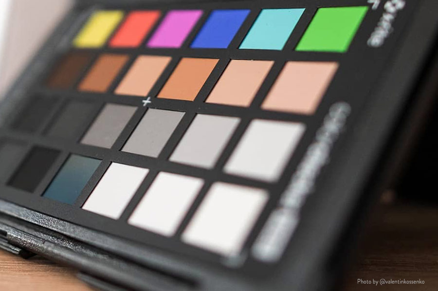
If we take a close look at the palette from the Sean Connery ad we get the swatch below:

It’s always worth understanding why a colour palette works so we’ll delve into a little art history. Below is Claude Boutet’s colour wheel illustration from Traité de la Peinture en Mignature, the 1708 edition:
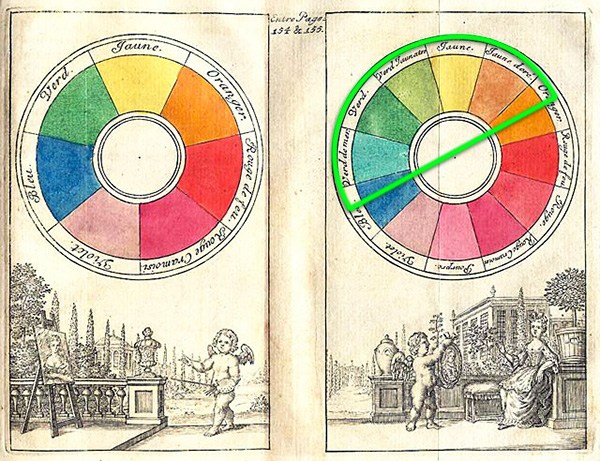
Take a look at the semicircle highlighted on the right side and you’ll note that good old Claude pretty accurately predicted a Sean Connery man-bag ad from 300 years in the future. Well played Sir.
Pleasing colour aesthetics and complimentary colours were intensely researched centuries ago by painters, so we have an astonishing store of that knowledge as 21st century photo retouchers to draw upon. The palette here is a broad analogous range, where the colours are harmonious because they sit adjacent on the colour wheel.
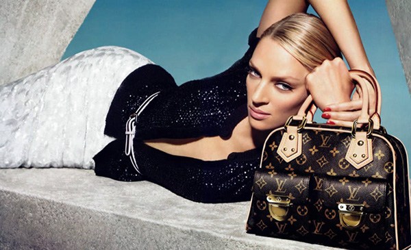
Uma Thurman, ©Louis Vuitton
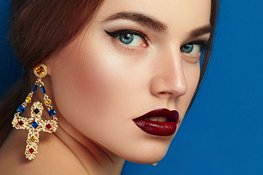
Note from the Uma Thurman shot above how the eye is drawn to the product. The blue/cyans even push into the shadows of the clothing, contrasting the swathe of orange tones starting near the belt, through the (sharper) face, through to the (even sharper) bag. The blue shadows aren’t present in the product, the redder tones quite purposefully contrast (with the help of added sharpening) to draw the eye.
This is more of a complimentary colour scheme, using opposites on the colour wheel and bypassing much of the analogous range present in the sand and greenery of the Connery shot, but in using similar cyan/orange basepoint opposites retains a similar feel.
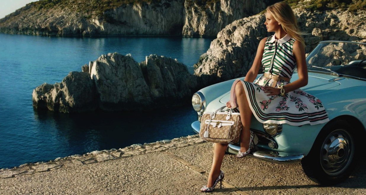
Cruise, ©Louis Vuitton
The Louis Vuitton ads are a great example of tying a campaign together using colour theory, a sound knowledge of which can be invaluable to any photographer or retoucher looking to draw on hundreds of years of research into the psychology and effect of colour harmonics. Note below that the colour of the car has been selected to fall within the same, on-brand analogous range and used to contrast against the warmer tones of both its immediate surroundings, the model, and the product itself.
Source retouchingtutorials.net.