
Today our guest writer, Art Director & Retoucher Alexey Adamitsky shares his methodical approach to a beauty photoshoot from an artistic perspective and outlines his thought process as well as workflow steps from the start of the shoot to the final touches in post-production.
—————
A few weeks ago I contacted beauty photographer Daniel Scheel, who had a beauty shoot concept in mind but needed an additional pair of eyes and a retouching expert for the post-production stage. The simple concept and the model he chose were what attracted me to this project in the first place.
The Shoot
Daniel’s biggest source of inspiration was a recent Harper’s Bazaar beauty editorial photographed by Yulia Gorbachenko and featuring an amazing model Luma Grothe. He then came up with his original vision, combining unique styling ideas, and a beautiful model.
Daniel shot with a Nikon D800E DSLR camera using an 85mm lens and a 105mm macro lens for closeups. The lighting setup was quite simple – a beauty dish on the main light, a softbox from the bottom left pointing up to fill in the shadows, and a small softbox for the background.
Selection
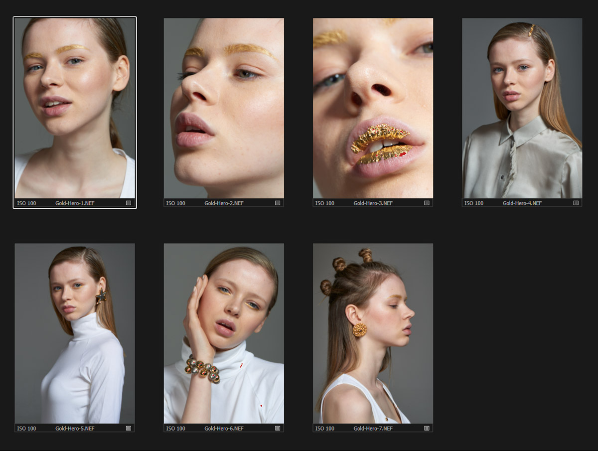
For a successful editorial, it is very important to create a cohesive storyline. We had some back and forth discussions on what would be a great selection for the story before I got down to retouching, here are a few examples from our exchange:
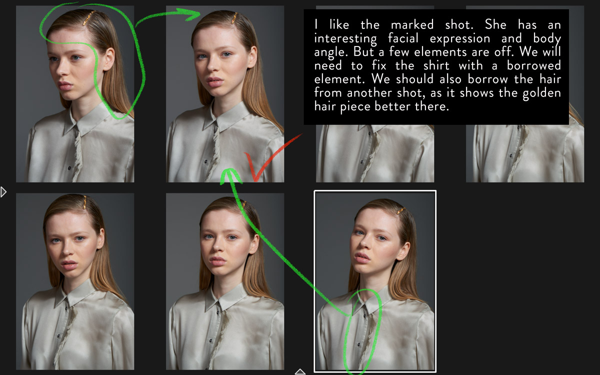
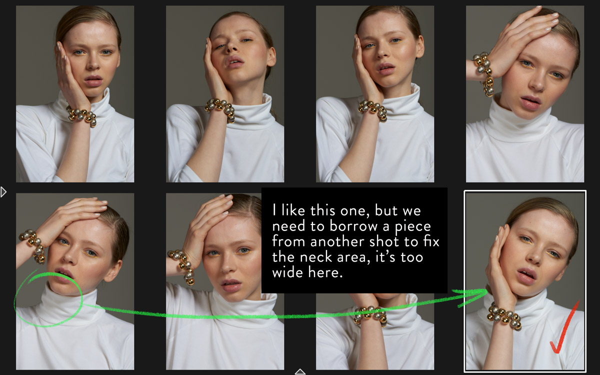
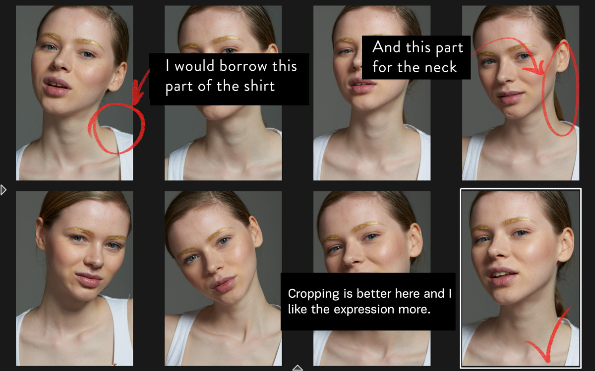
Eventually, we made the final selection of 7 images and additional source images to borrow parts from:
Composition Rules
I’d like to explain my thought process behind some of the selections.
I’m always looking for a great composition and there are a number of things that help create that. Let’s look at the examples below:
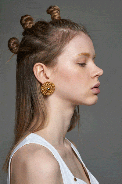
- Silhouette: The image has a strong silhouette which helps the viewer to easily read a body shape. Our brain looks for simple shapes and an image is more pleasant to the eye when it’s simpler to “read”.
- The way the lines in the image create direction helps to carry the composition and lead the eye.
- The Fibonacci Spiral: The Fibonacci spiral is a great tool to build your composition around as it provides strong points to lock the viewer’s attention.
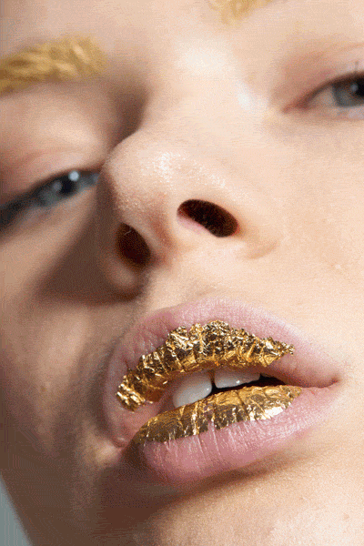
- Greatest Area of Contrast (GAC): The image above illustrates this rule of composition perfectly. The viewer’s eye gets locked in a triangle while traveling from element to element and stopping on the important parts of the image.
Post Production
Over the years I have built my workflow in a way that allows me to be highly productive.
Compositing
The first thing I take care of is the compositing: I fix all of the necessary elements in the image and borrow additional parts from other files.
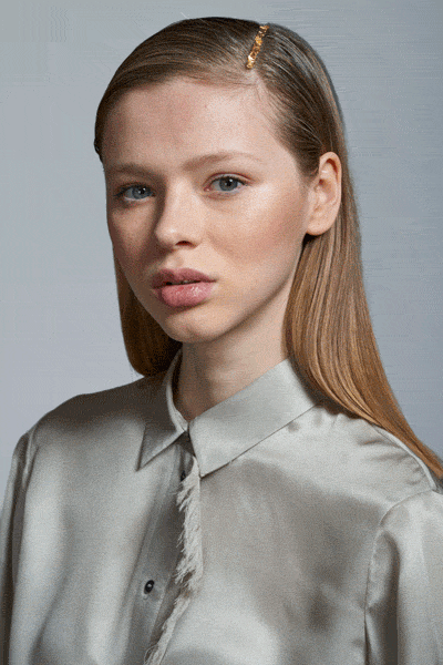
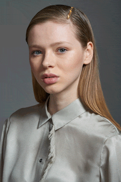
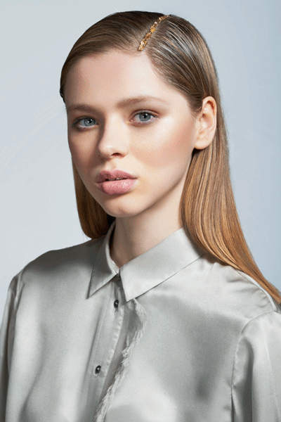
In this particular image, I wasn’t happy with the way the shirt and the model’s hair were captured. The shirt looked a little untidy and the golden piece in the hair was too far away from the face in the original shot. Fixing these elements by replacing them with the parts from other images at an early stage of the post-production process is much easier and more rational as performing heavy compositing at a later stage would cause a number of unnecessary issues.
Retouching
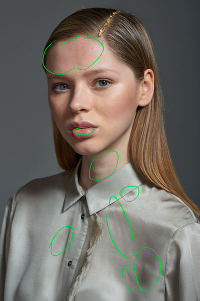
My retouching workflow begins with the basic clean-up: at this stage, I remove dust speckles, small hairs and blemishes such as pimples, small beauty marks, and fine lines.
Dodging & Burning comes next. I even out the bigger skin patches and deeper folds on the shirt. As I am looking to get a natural realistic result, it’s best to leave some imperfections in, but it’s also important to be selective and leave only the details that don’t distract the viewer’s eye from the important elements of the image.
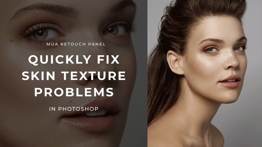
RELATED: Remove Blemishes and Wrinkles Quickly in Photoshop
I marked up the areas that bothered me the most in the following image:


Color
Color is a very important element in photography. It is what helps us suggest the emotions the viewer is supposed to experience when looking at an image. Daniel and I had a similar vision for the color mood for this editorial: we wanted the images to create strong positive emotions, so we chose a light and warm color-grading scheme.
RELATED: Color Grade Like A Professional
Color-grading can be quite complex but I decided to keep things simple and used the basic complementary color scheme to grade the image. My main colors were:

The color distribution across the whole image is intentional: the colder background brings more attention to the model color-graded with a warmer tone. There is a lot of psychology in the color theory that a strong artist must know and apply in their work.

I used very basic tools to achieve the desired result, mainly masks and curves:

The first step was to separate the subject from the background: I used ReMask software to create this and most of the selections you’ll see below. I use ReMask quite often in my workflow for precise selections. This tool has what I thought Photoshop was lacking prior to CC 2015.5 version. With the latest release, I have to re-evaluate the new improvements for the former Refine Edge tool (now the Select and Mask taskspace) in Photoshop and see if it makes masking as comfortable as the ReMask.
Then I work on the contrast of the image: I use luminosity masks quite often to target different value ranges in the image:
Time to work on the inconsistent color of the skin, which you can see in the image below. I exaggerated the colors in the areas that needed to be corrected:

The model’s neck was desaturated, while the areas around her mouth and the cheeks were oversaturated. I made a soft mask for the skin and color-corrected it:
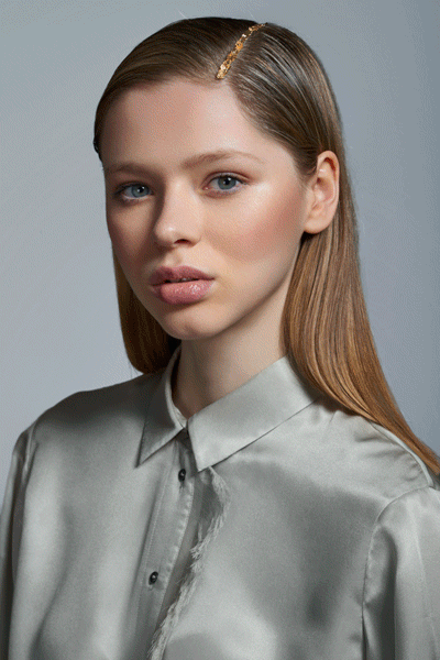
In the majority of the images, the clothes are bright, so I modified the shirt in this image to keep the look consistent throughout the story, then made the final adjustments to the overall contrast and saturation:
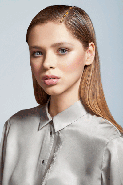
Here is the progression from the original state of the image to the final look:

Hope you enjoyed this article!
—————
Credits
Art Director & Retouch Artist: @alexeyadamitsky
Photographer: @daniel.scheel
Hair and Makeup: Sonia Ezama
Model: Eleanor Hayes @ View Management

Thank you! Fascinating article!!! I’d like more info on the illustration of the skin color inconsistencies, how it was exaggerated and what was done to correct it.
The Instagram link indicates it is forbidden.
Thanks @disqus_zGvWA0jfD9:disqus. I added it to my future articles list. I’ll write about it.
I know more things from this articel.Thanks a lot