Since I am a very intuitive photographer and retoucher, I might not always use the easiest way to achieve a certain result. For me the key to color correcting a photograph is the search for that tingling gut feeling that tells you “This is what it’s supposed to look like.”
For color corrections I use such general tools like Selective Color, Hue/Saturation, Levels or Curves Adjustment layers, or a combination of all of the above, often masking certain details.
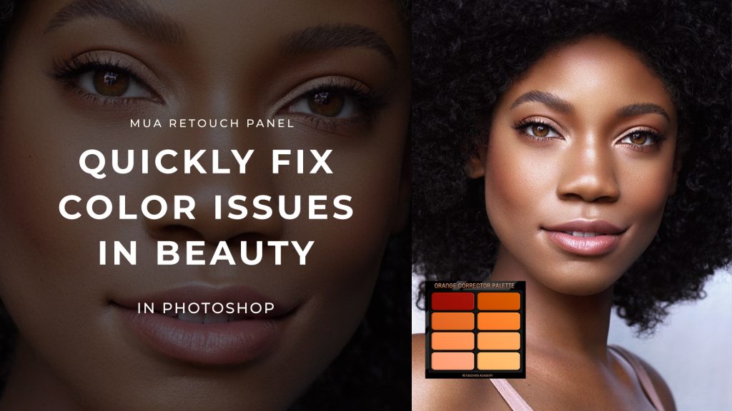
RELATED: How to Work Smart With Quick Mask in Adobe Photoshop
What I do strive for when color correcting photographs is getting a sense of unity, cohesion among images in a collection or editorial. Using different spectra can break the balance in your series of images. The challenge is to get the same vibe through a number of pictures, since not every picture will be lit in the same way. Also the camera settings might be a tad different in each or some shots, which you will have to correct in post-production.
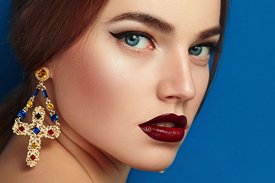
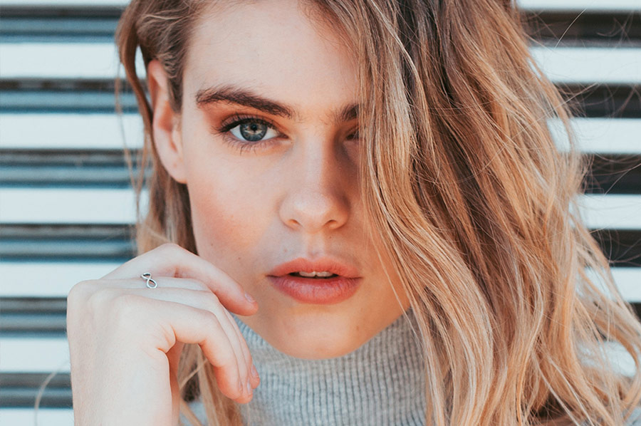
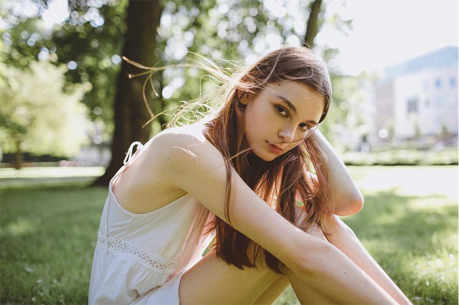
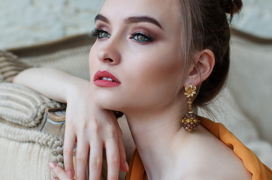
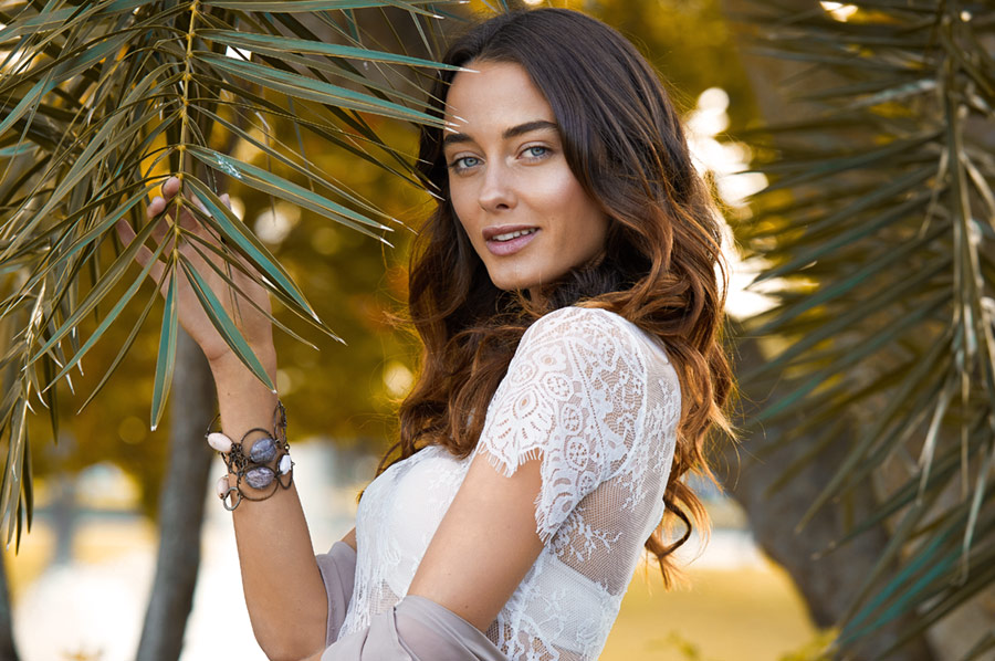
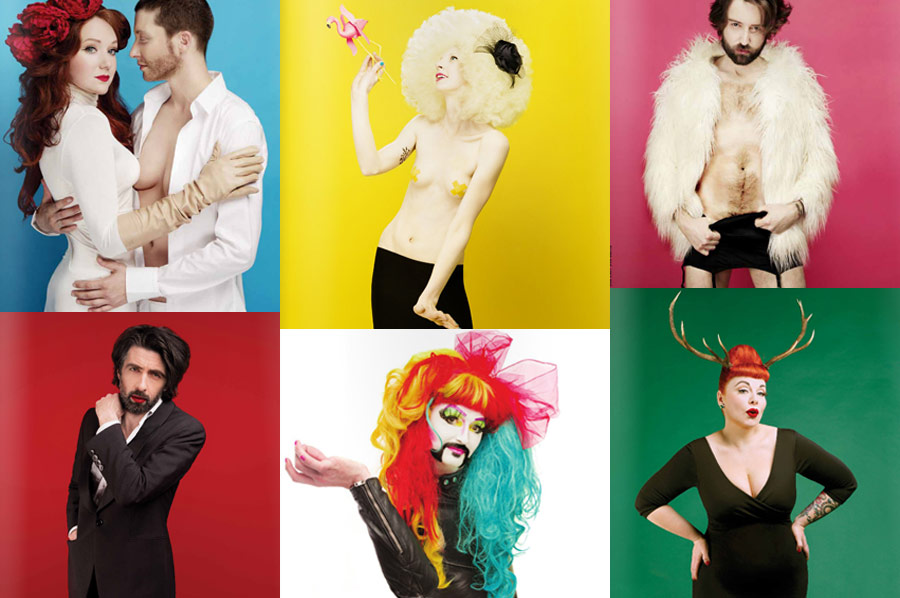
The image I will be using as an example to explain some basics in this article is the ‘Et Alors?” magazine cover series.
These pictures were all taken in studio at different times, similar lighting setups and different models. The client specifically requested bright skin color tones in final images. I kept that in mind when photographing, and used nice soft, even light to begin with.
Here is a closeup of the photograph I will be using as an example after skin retouching, before any color correction:

For this series I used 3 different Adjustment layers to make the general corrections and some local masks for certain areas.
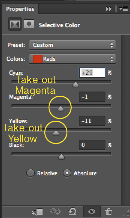
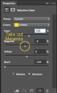
STEP 1. I started by taking Yellows and Reds out of the skin tones with Selective Color Adjustment layer. I didn’t adjust any other colors at this point.
You might ask why I didn’t simply desaturate the lot and be done with it? And my answer will be: Selective Color is a much more refined and sophisticated tool to work with when it comes to color correction.

.
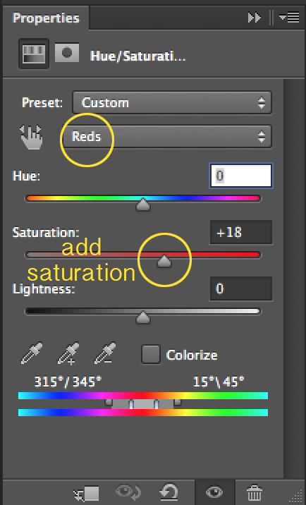 STEP 2. I then added a Hue/Saturation layer to saturate only red color in the flowers and the model’s lipstick. It added a tiny bit of life back into the couple’s skin as well.

Why take the red out and then put it back in? I wanted a slightly deeper red, more punch to it, which is done best when you saturate it after the orangey tint is dialed down in the original picture.
Compare original colors with the colors we achieved in two simple steps : 

STEP 3. I added a Curves layer on top of the layer stack to hitch up the mid tones and give the image this extra crunchy punch in the contrast department.

STEP 4. I also added more detailed shadows and highlights on the “male” model’s face with the help of masked Levels Adjustment layers.

You can see the placement of all the additional Adjustment layers I used to color correct this picture. 1-2-3 is the order of the steps I’ve explained above:
 .Compare the original colors and the final results after our color corrections:

.
After I performed all necessary color corrections on the first photo of the series, I used this exact combination of Adjustment layers, applying them to the rest of the images. In essence, I copied the General Color Corrections group of layers and pasted them onto the layer stacks of other images.
You can simply drag layers or a group of layers from one image onto another to copy them.
I still had to adjust the colors a little bit in each photo, but the general feel and the models’ skin tone stayed consistent throughout the collection of images.

.
TECHNICAL TIPS FOR BETTER RESULTS
- I always recommend working with Adjustment layers as it is a non-destructive method, as opposed to applying Adjustments directly onto the layers.
- Calibrate your screen every once in a while and the colors will be more truthful in print. Remember, not all of your clients will have a calibrated or even professional monitor. If a client complains about colors, they might be seeing something completely different than you, so if your screen is calibrated, you can be confident and assure your client that the colors will be alright in print.
- Test print your images to make sure the colors look exactly as you want them to. If possible use similar paper the final images will be printed on.
- Whenever there is a gradient in the background in your image, make sure you are working in 16-bit color depth to avoid banding of colors.
RELEVANT: Qualities of Digital Images: Bit Depth: 8-bit Vs. 16-bit
TIME SAVERS
- Name and group your working layers. It’s easy to lose track of what’s where after you’ve added a dozen of layers. This is true especially when you’re performing intense image manipulations.
- Make sure to make all other corrections (skin, outfits & figure retouch, etc) before you get down to correcting colors. Again, this is especially true for when you have a series of images to apply the same color correcting Adjustment layers to.
- When you are working on a series, create a group “General Color Corrections” and put all the important Adjustment layers in it. Copy this group into the rest of the images. Then put those images side by side in front of you and tweak the sliders in the Adjustment layers until all the images in the series are in the same color scheme.