
Bit Depth is a metric of how many unique colors are in the color palette of an image that are used to represent each of the colors. This is not to say that the image will make use of all the colors in the palette, but they can be used to specify necessary colors with a certain level of precision. Think of it as Color Depth.
Bit depth is the number of bits (0’s and 1’s) used to indicate the color of a single pixel. Images with higher bit depths can display greater range of colors, since there are many bit combinations available per pixel.
We know 1-bit color depth (21 = 2 colors) as monochrome, it is just pure black and white pixels. If we look at a grayscale 8-bit image, even though there are no other colors but black and white again, there are 28 = 256 possible shades of gray, in other words, 256 different intensity values of each of these colors, that can be used in the image.

And in the same fashion in a 10-bit grayscale image there are 210 = 1,024 possible shades of gray between black and white, and in a 24-bit grayscale image there are 224 = 16,777,216.
Bit depth represents the total number of colors a digital image can contain. The higher the number of bit depth, the higher the number of possible colors available in the image. Bit depth or color depth is only one aspect of color representation, expressing how finely levels of color can be expressed (a.k.a. color precision).
The other aspect is how broad a range of colors can be expressed – the gamut, but that’s a topic for a separate article.
Bits Per Channel vs. Bits Per Pixel
So far, we have been only talking about grayscale images, but when it comes to color we are looking at even more significant numbers of colors available in digital images.
Each color in a digital image is made up of the three primary colors – Red, Green & Blue. Each of these is known as a color channel and can have any range of values of color intensity depending on the bit depth. So here comes the main reason for the confusion – since there are three channels in a digital color image (RGB = Red, Green and Blue), a photo that is 8 bits/channel (bits per channel) would have 24 (8 x 3) bits/pixel (bits per pixel) and the total of 16,777,216 colors available. A 16 bits/channel photo would have = 48 bits /pixel, and so on.
24-bit images can represent 16,777,216 colors, and 32-bit images in addition to having the same 16,777,216 colors in the RGB channels, also contain an additional channel, which is called alpha-channel. It supports transparency in the image (only PNG, BMP and PSD file formats support alpha-channel transparency). You can read more about the alpha-channel transparency here, although it is more of a graphic design and illustration matter, rather than photography.
Why Does It All Matter?
When you look at a photo in 8 bits/channel and in 16 bits/channel color modes, even though there are plenty more colors in the 16 bits/channel image, it’s not very obvious to the naked eye. That is because according to Günter Wyszecki (1925 – June 22, 1985), German-Canadian mathematician/physicist who made important contributions to the fields of colorimetry, color discrimination, color order, and color vision, the human eye can only distinguish as many as 10 million colors. And as we just calculated even an 8 bits/channel photo already exceeds 16 million colors.
So, why is it important to work in the higher bit depths for digital image editing if we don’t even see the difference?
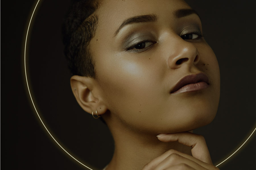
There’s one big issue with the lower bit depth, which you need to be aware of, it’s called color banding. It is an inaccurate color representation in computer graphics or in print. It can easily ruin photos, especially those with smooth gradients (be it a studio background, skin tone or a beautiful sunset in the sky).
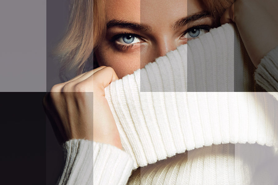
Here’s an example of banding in the 8- and 16-bit color modes that can happen to a smooth gradient after some ordinary manipulations in Photoshop:

You can see that it is obvious in the 8 bits/channel mode and practically not noticeable in the 16 bits/channel mode.
You may ask why I am not even mentioning 32-bit depth, and the answer is simple – it gives you way too much trouble than it’s worth. Your masterfiles become huge, each simple manipulation takes time for processing, and most Photoshop filters don’t even work in the 32 bits/channel mode.
Real-World Troubles
The worst part about color banding is that is can become visible after the final image is out of your hands. For example, you’ve submitted a photo you retouched in the 8 bits/channel mode to your client, and your client sent it off to a publisher or a printing lab to get it printed in a magazine or his or her promo materials.
Imagine, getting a copy of that magazine a few weeks later, finding the image you retouched and seeing horrible color banding across the background or on the model’s skin.
Needless to say, that you would not only possibly lose your client, ruin your own professional reputation, you would also indirectly let down the third party if, for example, those images were printed in a magazine.
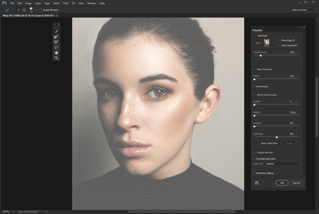
To avoid nightmares like this, it is best to do all retouching work in 16 bits/channel masterfile (PSD), so that there are trillions of colors available for Photoshop to build smooth gradients from. After the job is done, submit the images that are created for print in TIFF (choose NONE for compression). Better yet, find out what file format the final client or the printing lab requires for the best print quality and convert your flattened PSD into that format (keep the PSD masterfile un-merged in your archives though).
Keep your work top quality throughout the entire creation process, even after your job is done, until the images are out there for the world to see. Educate your clients when needed, it will only demonstrate your professionalism and expertise, which is necessary for your business reputation and success.
RELATED: Read more in Introduction To Digital Imaging
Key Takeaways
- Work in the 16 bits/channel color mode to avoid banding.
- You can set the Bit Depth of your image when exporting it from your Raw converter (Camera Raw, Lightroom, etc.).
- Keep your masterfile (PSD) in 16 bits/channel mode even after you finish editing the image. Archive your masterfiles in 16 bits/channel – you just never know in what way they can become useful in the future.
- Create a flattened copy of the retouched image for your client and convert it into the file format that your client requires. Remember that you can save your 16 bits/channel image in JPEG, without having to change the mode (in Photoshop CS6), but it will actually only save in 8 bits/channel.
- There are a few situations when 8-bit depth can be useful though:
- when you are sending previews to your client and the quality of the image doesn’t matter all that much at this stage.
- when you need to use a filter that isn’t active in 16 bits/channel mode.
- when you need to down-size the image and you’re pretty sure no visible banding will happen due to the nature of the image (no smooth gradients or vast areas of same color in the photo).
- If you happen to deal with an 8-bit depth image, which already has banding – the best way to fix it (if possible at all in the particular image) is not to Blur it, but to add Noise to it.
- To change bit depth of an image in Photoshop go Image > Mode > choose the color mode you need.


Very useful info.. Thanks!
Thank you Anjan!
Thanks a lot!
Thank you Genia 🙂
My lab only accepts 8 bit jpeg sRGB. Does it mean that even after I work on the image in 16 bit the banding would be visible in gradients when I save the image into 8 bit jpeg?
Hi there, sorry just saw your comment. I think this very recent conversation in the Retouching Academy group will give you more info and opinions to make the right conclusions:
https://www.facebook.com/photo.php?fbid=10214718656019853&set=gm.1767586403281837&type=3&theater
Hi Julia, thanks for the background information, however I believe your information is not accurate when you say that you have to work on 16bit to avoid banding.
My workflow:
I can work on 8-bit files with 100s of layers and my equipment will handle it without any stress and in the final output I can convert to 16-bit to make a flatten version.
-Guess what? Photoshop will preserve this information and render smooth gradients on 16-bit. 😉
Hi Diego,
Thank you for sharing!
Why don’t you join this information, I think your point of view will be very valuable and actually align with mine: https://www.facebook.com/photo.php?fbid=10214718656019853&set=gm.1767586403281837&type=3&theater
Hi Julia,
Sure thing!
I’ll document the info and create post or maybe a video explaining it. Hopefully it’ll get publish. I also believe this will be very useful to everyones workflow.
That would be wonderful, thank you Diego!
Thank you for the information shared. Does CC save the 16-Bit Images as 8-Bit JPEGS or one has to do so manually?
Hi there!
Not sure what you mean by that.
Thank you! some very useful info here!
Thank you very much.